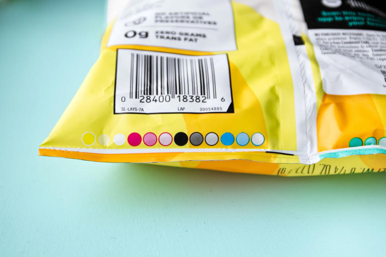
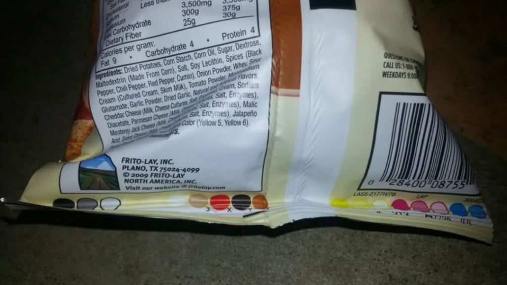
Have you ever taken a closer look at a snack wrapper or bag of chips? Beyond the nutrition facts and serving sizes, which often seem designed to make you feel guilty, there’s usually a feel-good story about the brand’s history. These narratives aim to convince you that you’re enjoying a wholesome treat made with love and care. However, if you look beneath all that, below the copyright information and the bar code on the food package, you might find a colorful mystery waiting to be uncovered.
The packaging design itself can also be a treasure trove of hidden meanings and symbolism, with the colors, fonts, and imagery used carrying subtle references to the brand’s history or underlying values.
Beyond the aesthetic appeal and feel-good stories, the sourcing and production processes behind these snacks can also be a source of intrigue. Where do the ingredients come from? What sustainable practices are employed in the manufacturing process?

The Rainbow of Circles: A Colorful Mystery
What do these rainbow circles mean? Could deciphering these snacking runes grant you a lifetime supply of treats? The answer, unfortunately, is no. But these aesthetically pleasing circles do serve a purpose, one tied more to packaging and graphic design than to nutrition, freshness, or taste.
The Purpose Behind the Colorful Circles
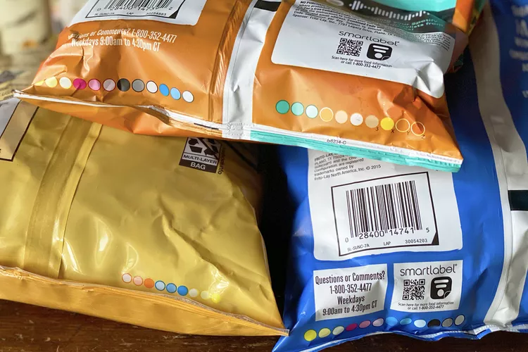
These colorful circles, known as “process control patches” or “printer’s color blocks,” ensure the colors used to print packaging are accurate by testing how a specific set of “process colors” appear. Essentially, they act as a design checklist before the product is shipped out.
Understanding the Process Colors

Typically, you’ll see circles of black, magenta, cyan, and yellow, which can combine to form a wide variety of hues. If you have a color printer at home, you’re likely familiar with the power of these particular shades. However, some packages feature colors that are key to the brand’s identity. For example, a Cheetos bag prominently displays a specific shade of orange. In these cases, you might see circles of non-primary colors that match the brand’s tones.
Technical Information Encoded in Circles
While these circles may look like mere splotches of color, they contain valuable information about printing performance. As an old General Mills blog post quoted by Slate notes, they are “essentially a tool used to understand how a printer is printing at any mom
ent in time to ensure consistency.” They convey “very technical information about printing conditions that allow printers to quickly adjust.”
Adjusting Color Accuracy
If a color is not printing correctly, printers can spot the issue and adjust the process, either by adding more of a given color or taking it away. Modern printing practices sometimes allow machines to “read” these colors and determine if adjustments are needed. However, human operators typically make the final adjustments, as noted by Dillon Mooney, a technical consultant for Printing Industries of America.
Packages Without Circles

Not all packaging includes these colorful circles. This is largely a matter of personal preference, as these codes have no bearing on the health and safety of a food product. With an understanding of their role, you might admire the confidence of printers who feel they can achieve accurate colors without these tools.
Conclusion: The Role of Design in Snack Packaging
So, there you have it: more than you ever needed to know about the mysterious, colorful circles on the bottom of food packaging. These circles are more about graphic design than snacking and do not indicate anything about the quality of the food inside. Still, they provide an intriguing glimpse into the world of packaging design, making them more fun to ponder than reading the nutrition facts.